Ruth Handler, co-founder of Mattel, was inspired to create Barbie after observing her daughter Barbara playing with paper dolls and imagining them in adult roles. She recognized the need for a three-dimensional doll that could represent adult women and provide girls with broader play possibilities.
Barbie made her debut at the American International Toy Fair in 1959. She was introduced as a teenage fashion model dressed in a black-and-white striped swimsuit, high heels, and sunglasses. The doll had a slim figure, blonde hair, and blue eyes. Barbie was named after Ruth Handler’s daughter, Barbara.
Over the years, Barbie underwent numerous transformations and innovations. Barbie became a cultural icon and symbol of fashion, beauty, and aspiration. She represented different careers, from astronaut to doctor to athlete, inspiring girls to dream big. However, Barbie also faced criticism and controversies regarding her unrealistic body proportions and perceived emphasis on physical appearance.
Barbie expanded her presence beyond dolls and merchandise. She appeared in animated movies, TV shows, video games, and books. Barbie also collaborated with various brands for fashion lines, partnerships, and special editions, further cementing her influence on popular culture.
In recent years, Mattel has made efforts to address concerns about body image and diversity. They introduced dolls with different body types, skin tones, and hair textures, including curvy, petite, and tall Barbie dolls. Barbie has taken on more diverse roles, promoting inclusivity and empowering messages.
Throughout its history, Barbie has remained a beloved toy that has inspired generations of children. The brand continues to evolve and adapt to changing societal norms while maintaining its status as an iconic cultural figure. A HUGE part of this is maintaining a strong brand identity.
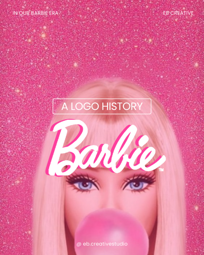
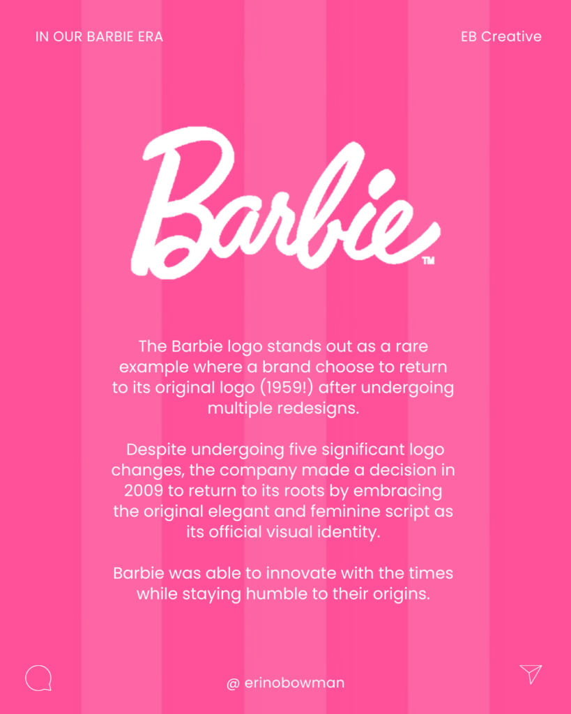
Throughout the years, the Barbie logo has evolved to reflect changing design trends while maintaining a consistent brand identity. By returning to their original 1959 logo the Barbie brand is one of the great examples that sticking to your roots can take you far. The Barbie logo has played a crucial role in establishing Barbie as an iconic and recognizable brand worldwide.
1959 to 1975: The Original Barbie
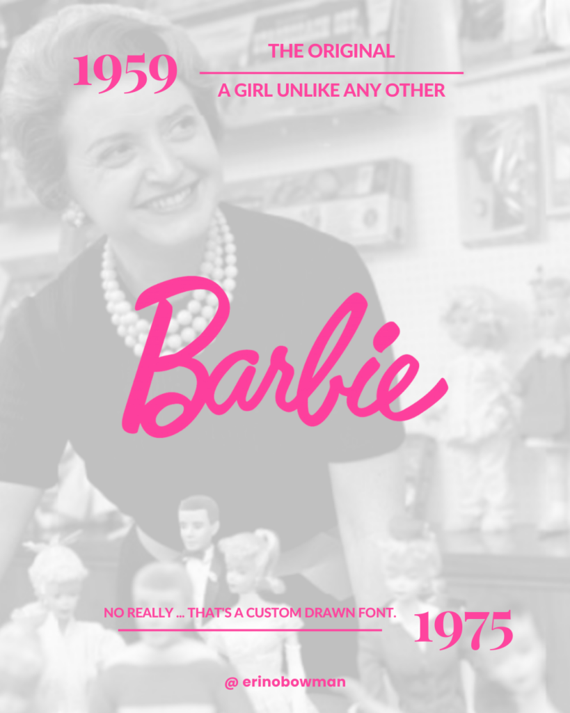
The original Barbie logo featured a script font with the stylized name “Barbie” written in lowercase letters. The font had a playful and feminine appearance, reflecting the brand’s focus on fashion and glamour. The logo was usually printed in pink or black.
1975 to 1951: The Modern Barbie
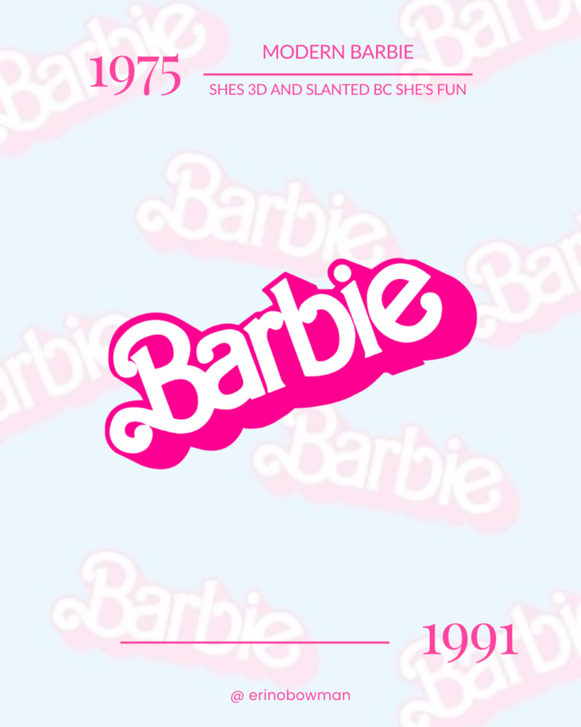
This was the second logo for Barbie and it marked a significant shift for the brand, deviating from its original logo. After utilizing the logo introduced during the company’s inception, Barbie opted to contemporize their brand, resulting in a fresh three-dimensional design. While the brand colors remained unchanged, the new logo retained the initial letter capitalized while the rest of the letters were presented in lowercase. Notably, the designers made an intriguing decision to align the letters in a more uniform and cohesive manner while also having the logo slanted upward; this was done to add a feeling of levity and happiness to the logo.
1991 to 1999: The Vanilla Barbie

After utilizing the large 3D logo for 16 years, Barbie opted for a redesign. The new logo, which removed prominent shadows and made subtle modifications to the font, particularly the letter B, exuded an enhanced sense of elegance and cheerfulness. Additionally, Barbie embraced a more subdued color palette, shifting away from the vibrant, deep pink to a softer, pastel hue.
The Back to the future Barbie.
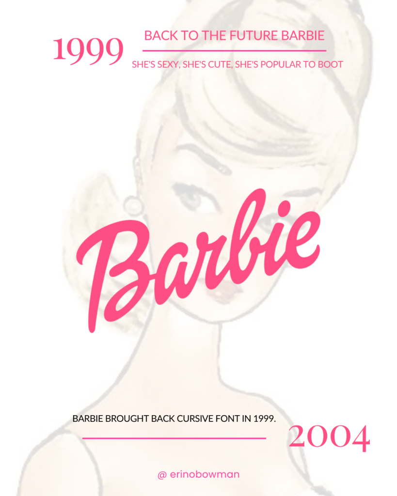
In the subsequent logo redesign of Barbie, the capitalization and slant of the logo remained unchanged. However, the font type was reverted to italics, reminiscent of the original logo. The connected letters in the logo imparted a hand-drawn and personalized appearance. Although the color was slightly adjusted to a slightly brighter shade, the consistent use of a single hue across the entire logo was maintained.
The Flower Power Barbie
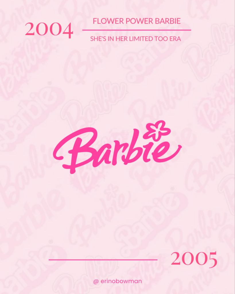
Unfortunately, this version of the Barbie logo endured for only a year. It featured a sweeping cursive arc for the first letter and replaced the dot of the “i” with a five-petal flower design. This childlike interpretation catered to the brand’s primary audience of children. However, many felt it lacked sophistication, leading to its short-lived existence.
The subsequent Barbie logo font moved away from cursive and adopted a more handwritten style. The slanted design was also removed, improving legibility and enhancing its appeal to children. Additionally, the color was subtly adjusted to a brighter pastel pink shade.
The Updated Barbie
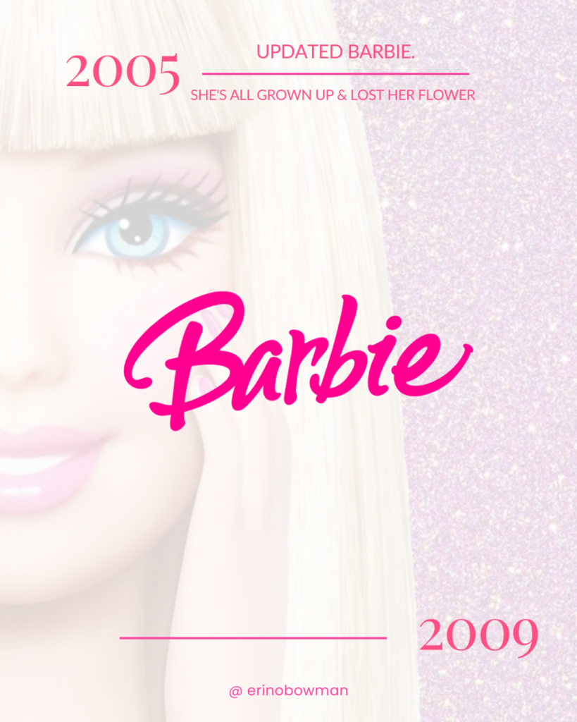
This logo bears a striking resemblance to its predecessor. The sole distinction lies in replacing the five-petal flower with a simple dot on the “i.” Additionally, the color has been intensified, transitioning into a darker pink shade that seamlessly commands attention.
The Retro Barbie
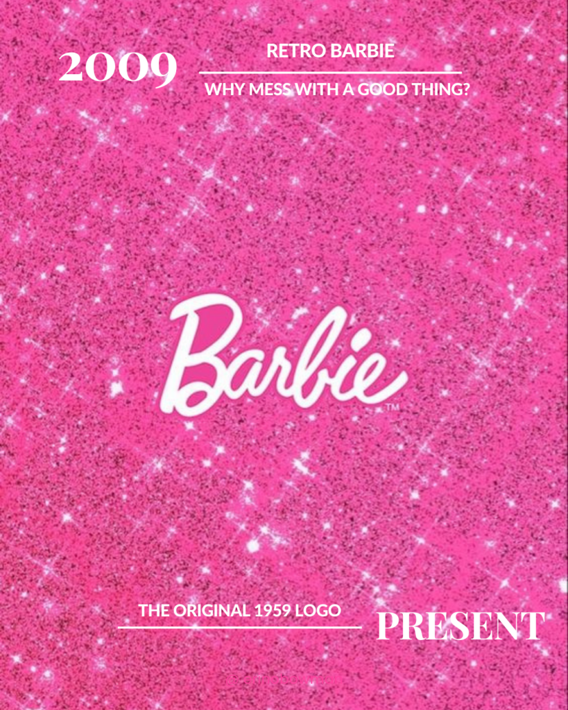
Meticulously crafted, Barbie has embraced a revival of its 1959 appearance. This concept masterfully embodies the essence, visual appeal, and iconic elements of Barbie. Among the numerous iterations of the Barbie logo throughout the years, the original was selected due to its profound significance in the brand’s evolution. It’s a remarkable return to the brand’s roots!
Barbie has successfully maintained customer engagement by innovating while remaining true to its origins. This demonstrates their ability to adapt to the changing times while humbly honoring their heritage.
IN OUR BARBIE ERA
Thanks for following along with the first of the EB Brand Capsule Series! Our goal is to research, inform, and analyze the trends that make (or break) successful brands.